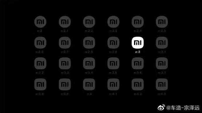
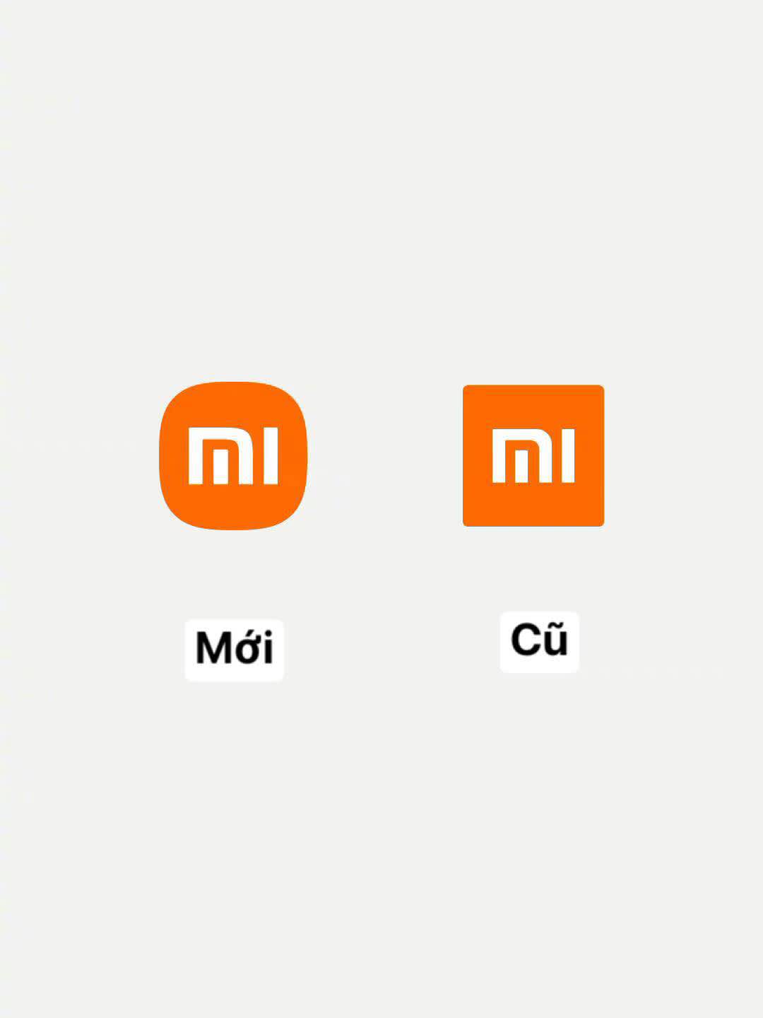
Recently, the launch of a new logo design by Xiaomi has attracted the attention of many netizens because this logo template looks like the old logo at a glance.
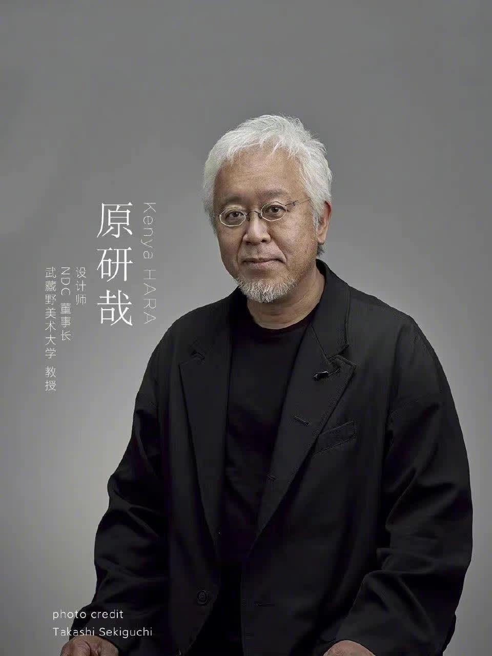
It is known that the company spent about 2 million yuan (7 billion VND) to cooperate with the Japanese design master Kenya HARA.
In the announcement on Weibo, Xiaomi said, “The new logo not only changes the appearance, but also upgrades the inner spirit.
In order to harmonize the Xiaomi brand identity with Eastern philosophical thinking, the famous international designer Kenya Hara and Xiaomi together proposed a new design concept starting from 'the relationship between technology and life'."
- What is the best software for business project management?
- What is wireframe? How to set up an efficient Wireframe?
- Something about corporate branding
- AI và Cá nhân hóa Nội dung: Chiến lược Tối ưu hóa SEO Thời…
- Sử Dụng AI Để Phân Tích Nội Dung Đối Thủ Cạnh Tranh
It sounds sublime, but most netizens wonder where the new logo is different from the old one, even that the company's CEO has been scammed.
- I can't help laughing
- No soul anymore, how beautiful the square is
– Designer: it takes 1 minute to draw the circle, 1 month to convince the boss
- This is called art
– Honestly, the new logo is better but I don't think it's necessary
– I don't need 2 million, give me 20,000, let me do it
Although the new logo was not popular with the public, in terms of marketing, perhaps Xiaomi has succeeded. Because the old logo of the company is extremely familiar to many people, if it changes the logo too differently, it will lose its inherent brand identity. In addition, this also brings effective communication, becoming a hot topic on social networks.
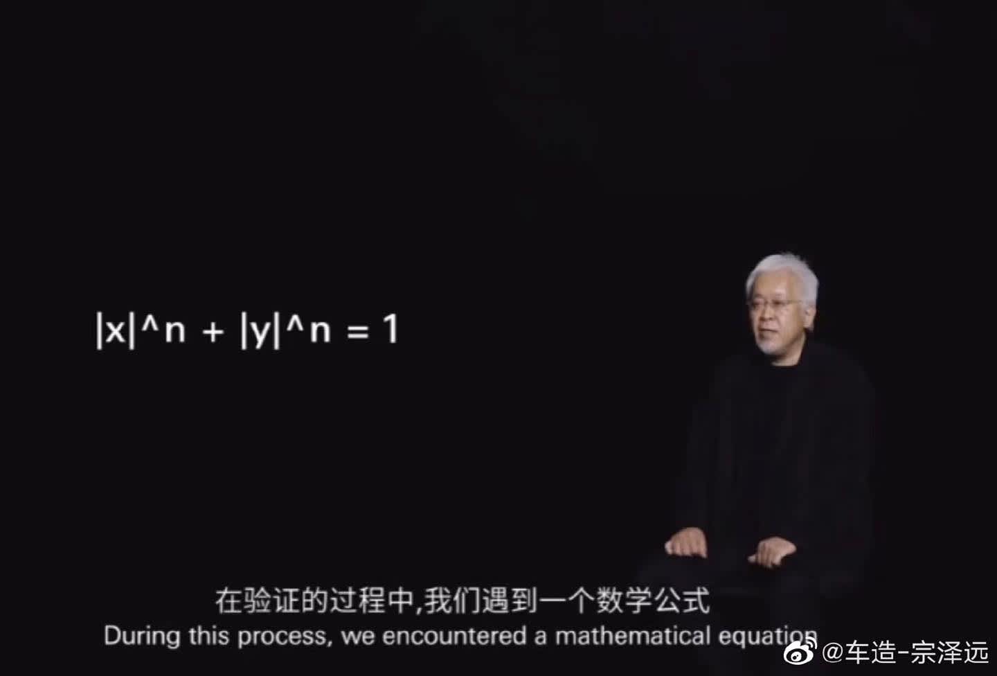
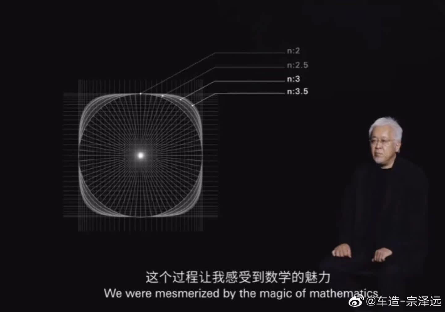
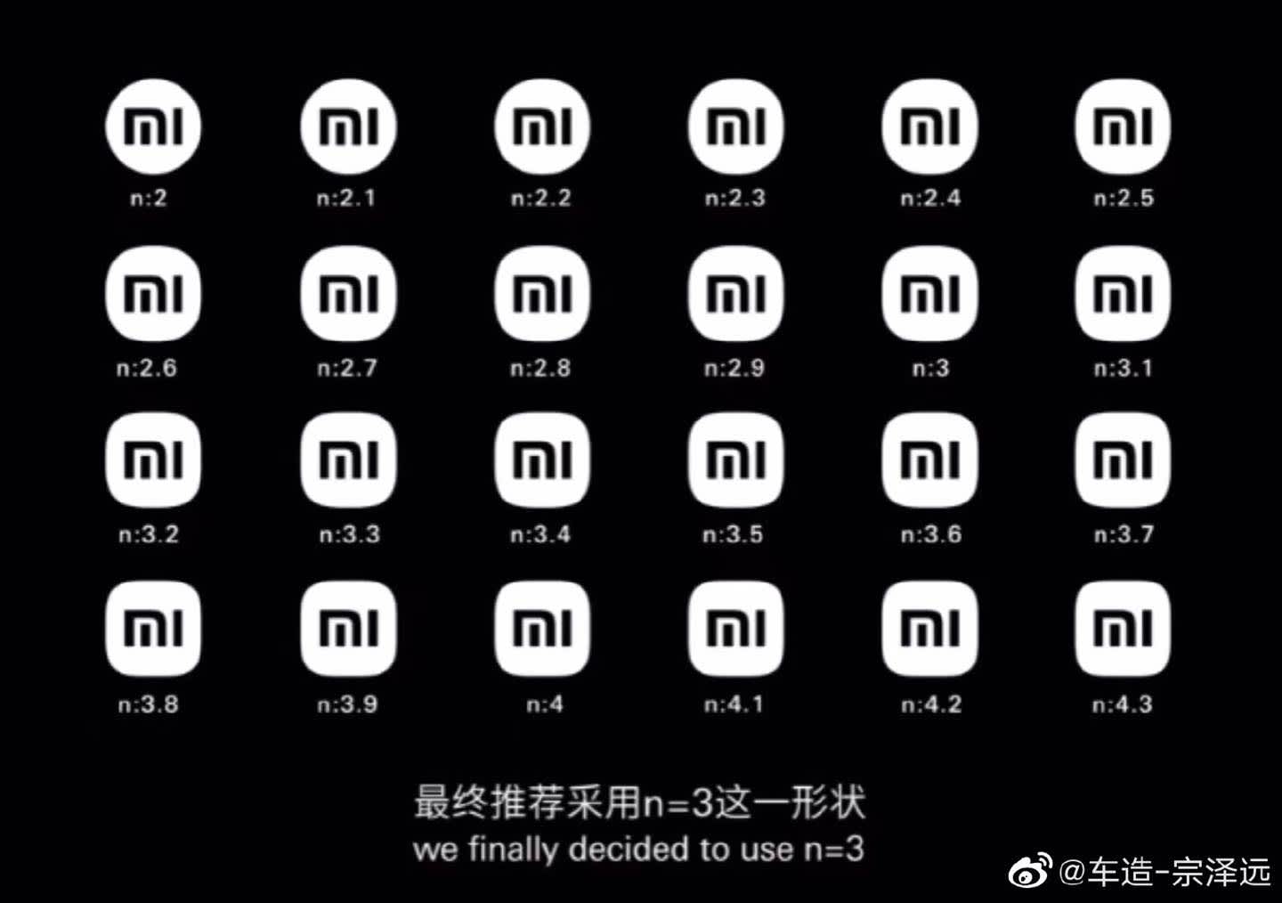
In terms of design, Kenya Hara said he used an algorithm to find the shape for the new logo, balancing square and circle, in line with the "Alive" concept and Xiaomi's business philosophy.

