
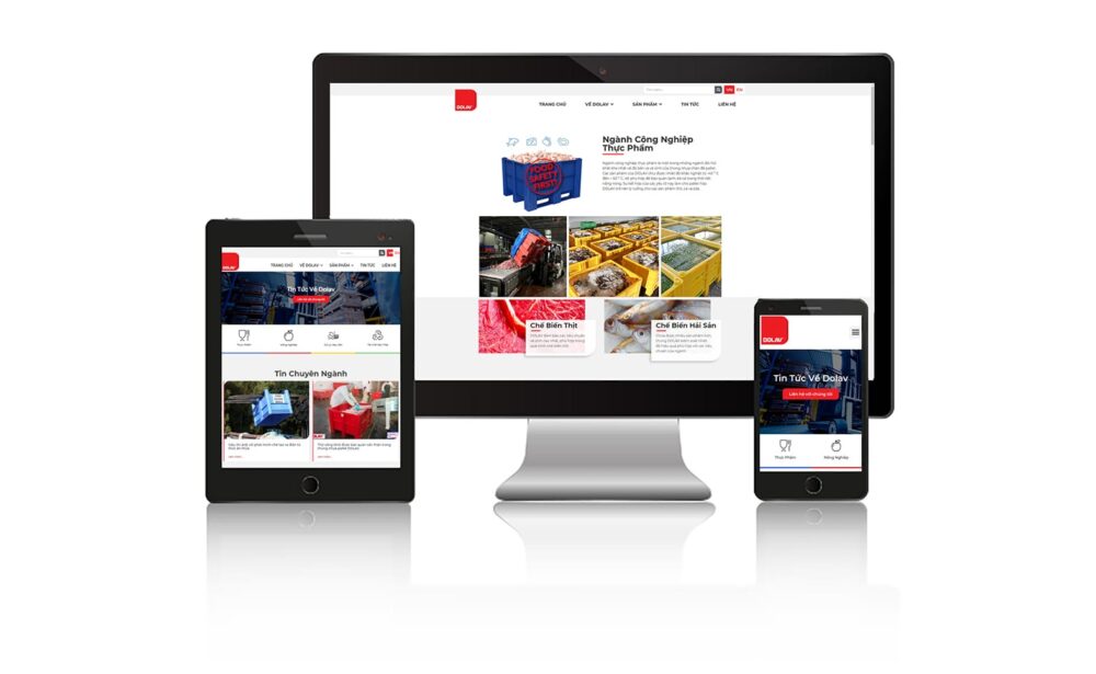
The challenge of getting the web to run on mobile is an important one that web developers face. Mobile has distinctive features that are different from desktop computers, and optimizing a website for this device requires special attention and technical knowledge. In this section, we'll cover the specific challenges and key factors of making the web run on phones.
Small screen size:
One of the main challenges when making the web run on phones is the small screen size. Mobile phones often have smaller screens than desktop computers, which requires developers to design interfaces that are suitable and easy to use in this limited space. Elements such as arrangement, font size, graphics, and images must be adjusted to display properly on small screens.
Touch interaction:
Mobile phones use touch technology, and the interface design must be responsive to the user's touch interactions. This includes swipe, touch, drag and drop gesture handling, and ensures responsiveness and responsiveness of touch responses. Web developers need to ensure that interactive elements, like buttons and menus, are large enough and easy to press on small screens.
Page loading speed:
Page speed is an important factor in mobile user experience. Mobile users often expect websites to load quickly and be instantly accessible. Therefore, it is very important to optimize page load, including optimizing image size, using cache, reducing the number of requests, and using data compression technologies such as GZIP.
Performance optimization:
The performance of a mobile site is critical to ensuring a smooth user experience. Optimizing performance includes minimizing resource usage, optimizing source code, using partial and preloading techniques, and ensuring compatibility with different mobile browsers. .
In short, making the web run on mobile presents many challenges for web developers. However, with an understanding of factors such as small screen sizes, touch interactions, page speed, and performance optimization, web developers can create websites that run well on mobile phones. dynamic and provide a better user experience.
Explore more: https://www.jaybranding.com/thiet-ke-trang-web-chuyen-nghiep-chuan-seo/


 Vietnamese